OjaExpress
Redesigning an online marketplace to help people discover and order cultural groceries from local stores in Chicago, while learning how cultural context shapes navigation, language, trust, and product discovery. The work achieved improved satisfaction and task completion.
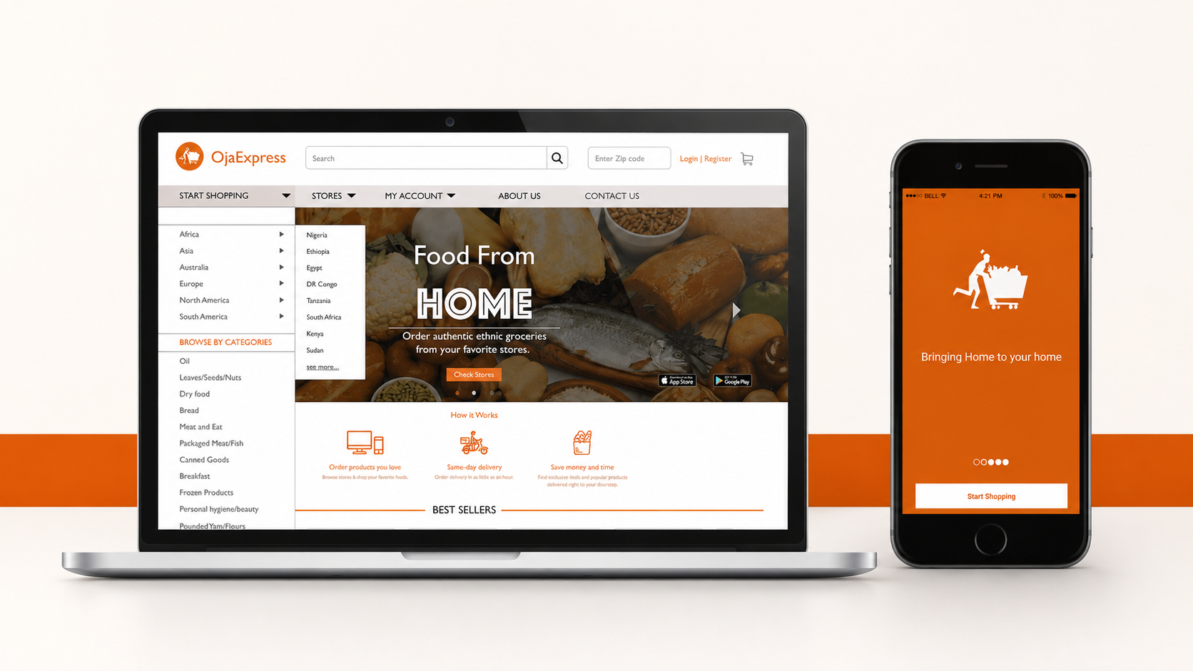
Role: UX Designer | Timeline: Summer 2018
Scope: User research, usability evaluation, information architecture, interaction design, visual design, and prototyping
Context
OjaExpress is a Chicago-based marketplace for discovering and ordering cultural groceries from trusted local international stores. During my internship, I redesigned its website to create a more transparent and time-saving shopping experience for people from different cultural backgrounds.
The goal was to help customers quickly understand what OjaExpress offered and find familiar products without needing to understand how the marketplace organized them.
The challenge
The existing homepage did not clearly communicate:
What kinds of groceries were available
Which communities and regions were represented
Where delivery was offered
How customers should begin shopping
Customers could browse products, but the experience did not adequately support the different ways people searched for culturally specific food.
The product catalog reflected many cultures, but the navigation did not reflect how customers thought about their groceries.
Research and discovery
I studied how people from different cultural backgrounds interpreted navigation, categories, language, and visual patterns.
Research methods: Cross-cultural competitive analysis, contextual inquiry, direct observation, think-aloud usability testing, user interviews, hierarchical task analysis, and iterative prototype testing.
Research showed that customers needed:
A clearer explanation of the marketplace on the homepage
Immediate visibility into products and stores
Search for customers who knew the exact item
Browsing by region, ethnicity, category, and subcategory
Clear information about delivery areas

The key insight
Outcome and Reflection
Some customers began with a familiar product name. Others thought by country, region, cuisine, or grocery category.
People searched using different cultural mental models.
A single navigation path would make discovery easier for one group while creating friction for another.
This led to a flexible product-discovery model built around three entry points:
Search by product → Browse by region → Browse by category
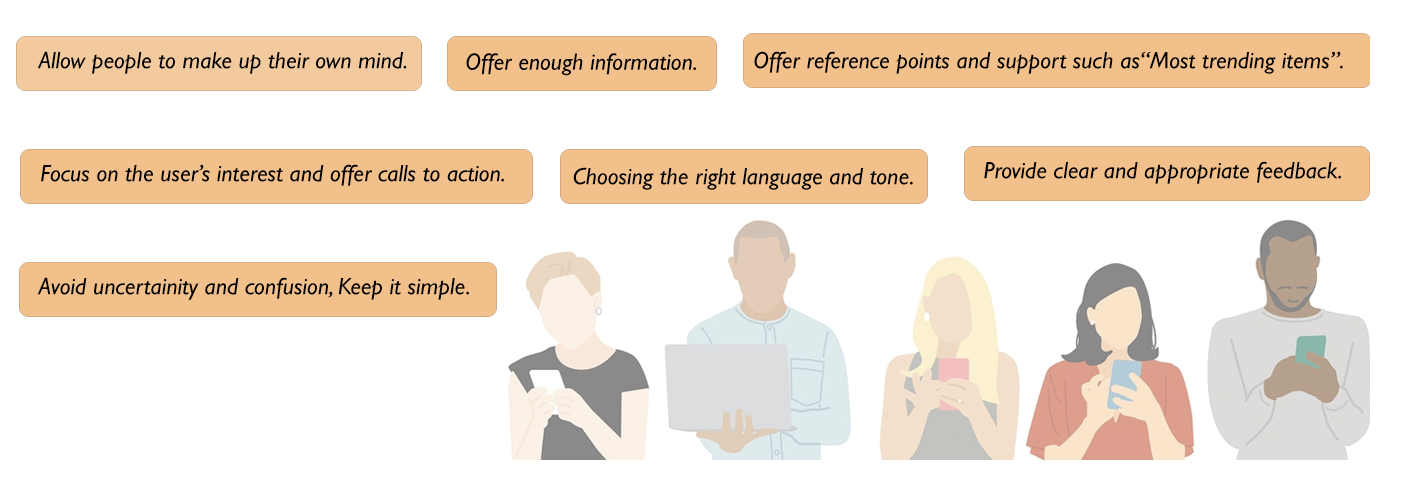
The redesigned experience
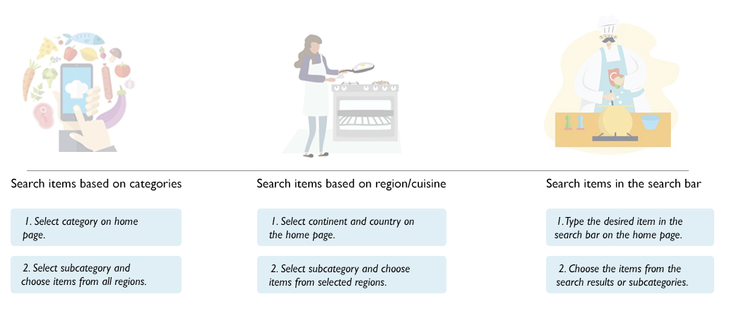
A homepage that explains the service
The new homepage established a clear starting point by showing representative products, supported communities, and delivery information before asking customers to shop.
Multiple ways to discover groceries
Customers could search directly, browse products associated with a region or country, or begin with a familiar grocery category.
Filters allowed them to narrow results without committing to one rigid hierarchy.
Clearer information architecture
I reorganized categories and subcategories around findings from the cross-cultural research, making the catalog easier to scan and reducing ambiguity between regional and product-based groupings.
A more transparent shopping journey
The redesigned flows made product availability, service areas, and next steps clearer throughout discovery and checkout.
Usability testing of the redesigned experience achieved:
~70% user satisfaction
~68% task-completion rate
The work gave OjaExpress a clearer product-discovery structure and a stronger foundation for serving customers across different cultures, shopping habits, and levels of familiarity.
This project taught me that inclusive design is not achieved by creating one “universal” interface.
It requires understanding the different mental models people bring to a product, and providing enough flexibility for each person to find a path that feels familiar.