Tissue Analytics
Designing connected mobile and web experiences that help clinicians capture wounds, review AI-assisted measurements, track healing, and manage patient records with less effort.
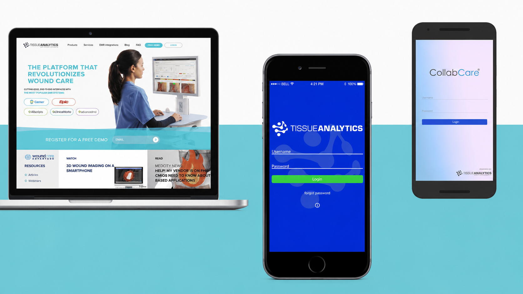
Role: UX Designer | Timeline: Aug– Dec 2018
Scope: UX research, usability analysis, user flows, interaction design, visual design, prototyping, and motion concepts
Context
Tissue Analytics developed technology that allowed clinicians to photograph wounds using a smartphone, automatically measure wound characteristics, monitor changes over time, and review the information through connected web and clinical systems.
I worked across its mobile app, web portal, and public website used across 14,000 facilities, helping clinicians document and track healing more efficiently while contributing to a 22% increase in onboarding conversion.
The challenge
The underlying technology could generate valuable clinical data, but that value depended on how easily clinicians could move through the complete workflow:
Set up a patient → Capture a wound → Review the analysis → Track healing → Document care
Usability gaps across onboarding, patient management, dashboards, and integrations made these connected tasks harder to understand and complete.
The goal was to make a complex clinical platform feel clearer and more connected without removing the information healthcare professionals relied on.
Research and discovery
I began with a usability analysis of the existing mobile app, web portal, and marketing website.
Research methods: Exploratory research, evaluative research, usability analysis, product-data review, workflow mapping, stakeholder interviews, competitive review, and iterative prototype feedback.
I mapped important user journeys, documented points of confusion, and worked with the team to understand technical constraints and business priorities. The findings were translated into revised user flows, wireframes, and high-fidelity concepts.
Clinicians did not need three separate experiences. They needed one continuous workflow across mobile capture, patient records, and clinical revie
What I designed
Outcome and Reflection
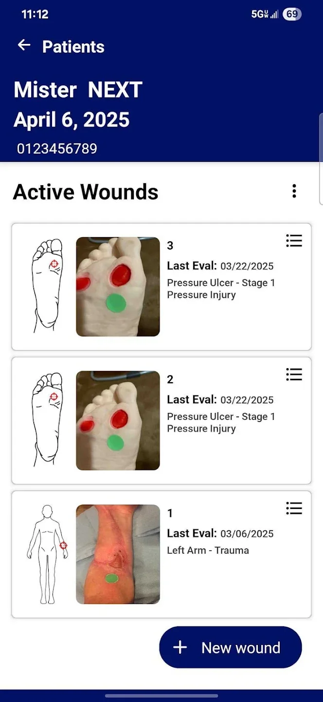
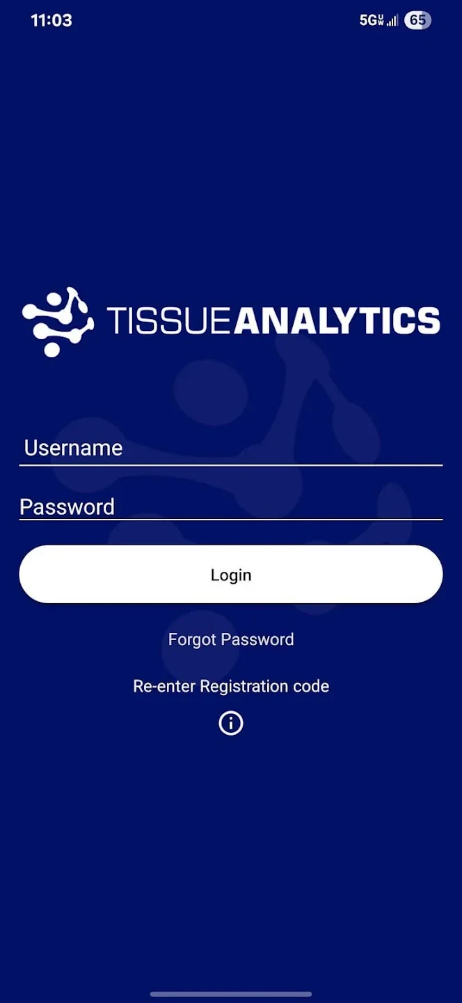
Clearer onboarding and patient setup
I simplified the path into the product and clarified the steps required to begin managing patients and documenting wounds.
The redesigned hierarchy helped users understand where to begin, what information was required, and what would happen next.
Connected patient-management workflows
I redesigned user flows across patient records, dashboards, and integrations so clinicians could move more clearly between capturing information and reviewing patient progress.
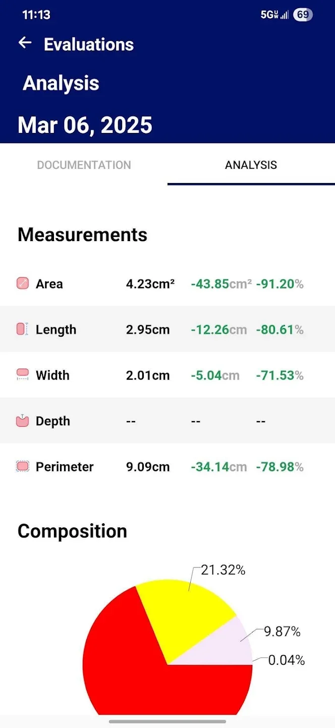
Dashboards that supported faster review
I explored ways to organize wound and patient information so important changes, actions, and progress were easier to identify without searching across disconnected views.
Prototypes that made the product easier to understand
I created high-fidelity prototypes and motion concepts to communicate new features and explain the platform’s value to internal teams, customers, and investors.
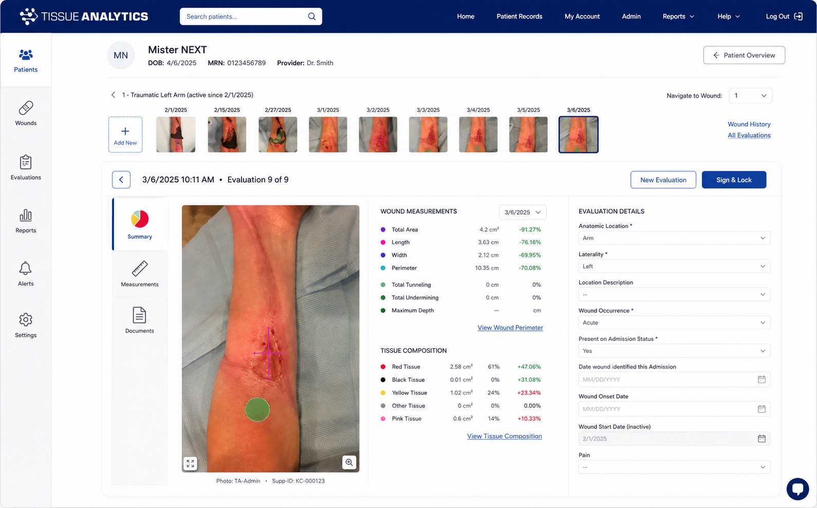
The workflows contributed to streamlined onboarding workflows to elevate conversion rates for a widely adopted healthcare platform.
The work also gave the team clearer prototypes for validating product direction and communicating complex healthcare technology to customers and investors.
This project taught me that simplifying healthcare software does not mean reducing clinical detail. It means organizing the experience so healthcare professionals can understand what has changed, what requires attention, and what action to take next.
Project details and research artifacts have been summarized to respect confidentiality. Public product information is included only to explain the platform’s context.